
By Dan Frommer. From the  archives.
Thursday, April 18, 2013 at 2:55 pm.
Design Of The Times: The Floating-Over-Everything Button
A micro-trend in iOS apps? The new Facebook and Foursquare apps have buttons hovering over — and partially obscuring — the content below.
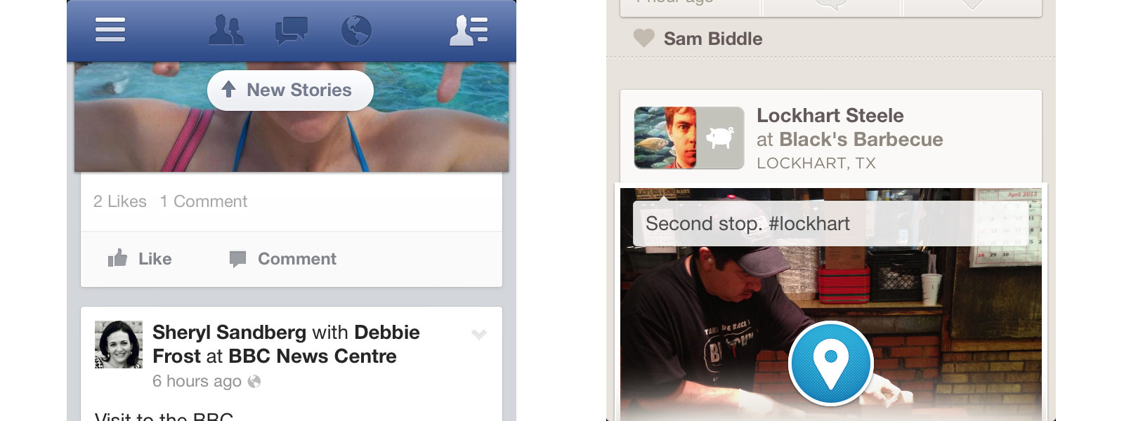
In Facebook’s case (left), it’s a pill-shaped “New Stories” button that shows up at the top of the screen when there are new News Feed items to load. In Foursquare’s app (right), it’s a big, round “Check In” button at the bottom of the home screen.
- It lets a button stand out without a navigation bar blocking off the entire width of the screen. (This is, perhaps, increasingly beneficial as screen sizes/resolutions become less consistent and predictable.)
- And it feels a bit more futuristic than the old nav-bars-of-square-buttons, in a Minority Report/Google Glass sort of way. Eventually, there might be a bunch of buttons hovering over our field of vision, on our car windshields, eyeglasses, wherever. This simulates that heads-up display effect.
- The downside is that it covers up some content. But less than a more-elaborate, full-width nav bar does. And if the button is drawn nicely, it will still stand out.
This isn’t a brand-new concept — Path, for example, has had a small floaty button in the bottom-left corner for a while. Sparrow, too, I’m reminded. And Apple Maps. And Google Maps, where the “Locate me” button is enough in the way that I routinely tap it by mistake.
And it could quickly become tired/overdone quickly — you really wouldn’t want to overuse this. But I think we’ll see more of this technique.
Previously: The Wrap-Around Ribbon

Check out my new site: The New Consumer, a publication about how and why people spend their time and money.