By Dan Frommer. From the  archives.
Monday, January 21, 2013 at 10:03 pm.
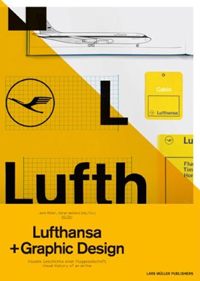
Book Report: Lufthansa + Graphic Design
 American Airlines unveiled a new look last week, throwing out its decades-old, iconic branding for a modern feel.
So it was timely and interesting to read this week about Germany’s Lufthansa, which also adopted a minimalist, Helvetica-based look in the 1960s, but remains committed to it.
Jens Müller and Karen Weiland’s Lufthansa + Graphic Design — $26.40 at Amazon, paperback — describes the research that went into establishing Lufthansa’s look in the 60s, the inconsistent branding it replaced, and some of the basic theory behind brand aesthetics. (Including the notion that an aesthetic, once established, “cannot, for a number of reasons, maintain a strong message forever” — ammo against the purists.)
It also includes neat color galleries of old Lufthansa advertising and in-flight publications — such as business-class meal menus — evolving over the years.
There isn’t a ton of text here — although the print is tiny, and everything is in both German and English — so it’s a pretty quick read. But if you’re into design or air travel, it’s worth having in your library. (And a book I’d still rather own in print than electronic format.)

Buy at Amazon: Lufthansa + Graphic Design

Check out my new site: The New Consumer, a publication about how and why people spend their time and money.